 My most recent web project made me realize once again how many moving parts there are when creating a website. Choosing a domain name, CMS and hosting seems trivial once the actual design and coding of the site begins. Everything seems ready to start working into the actual design, looking at palette colors, company logos and images. Yet before then, a very crucial part comes up: website navigation and user experience.
Yes, your company does manufacture great products. And I am sure that we all want to put everything out there - from product catalogs and order forms to press releases. But, how do we choose the optimal navigation for our website? How do we lead our user through its journey to product discovery and purchase? That has to do with simplicity. And simplicity is not easy. This time we will cover desktop websites only, leaving mobile sites for the next time.
Types of Navigation
Most websites have a couple of navigation systems. That depends on the purpose and the depth of the site. The most common structural navigation is divided in two categories: main navigation or global navigation and the local navigation or page-level navigation.
1. Global navigation
The global navigation is the most general and simplest of all. The main navigation menu groups common items with a short and descriptive names. The information contained on the menu is arranged in such a way that it gradually exposes its inner options.
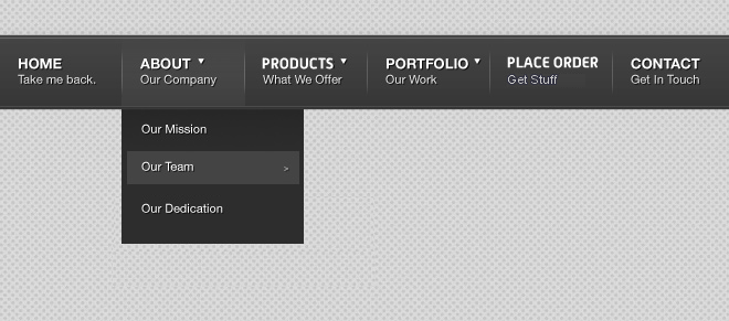
Fig. 1. Example of a main navigation.
2. Local navigation
Local navigation is used on the inner parts of the site that sits just below the main navigation. This navigation gives access to the material related to a specific group or category. There are some other kind of navigations that are either supplementary, leading to other content, like brochures, warranty information, etc., or courtesy navigation, like breadcrumbs, which allow users to know where they are at any point on the site.

Fig. 2 A local left-hand navigation that's simple and one level deep. This style of navigation also helps when a company is growing and will be introducing more products. "Siblings" and "children" can easily be added without many changes on the design.
With that being said, here are 5 steps to determine the most optimal navigation for your website.
5 Steps to Determine the Most Optimal Navigation for Your Website
1. Determine the purpose of your website
I know you have lost of ideas and purposes for your website. But take a deep breath and think. There has to be a main goal. Understanding that goal can help you weed out items that are complimentary, rather than essential to achieving your main goal.
Ask yourself these simple questions:
- Do I want people to see my products and then place a call, or do I want them to submit an order through a form?
- Do users come to my site to learn about my products or to buy—or both?
Defining the purpose of your site is a crucial step to start developing your main navigation menu.
2. Categorize the information
Review the information you have available. Sort it out and group it. Structure the content in the best simple way. Go from general to specific. One popular technique is using cards with all the names of the webpages and/or products you have. Sort them out and group them. You also could do a focus group, made of different types of customers your company has or wants. Ask the participants to group them the way they think the items written on the cards should be arranged. These steps will help you to understand what makes sense to your customers, not just what makes sense to you.
3. Mind the real estate
The space on your menu is valuable and the navigation should provide only those elements that allow visitors to move through the website in a minimalistic way. Once you have categorized the information, choose the main groups. Give them short and simple names. Mind the character length of the name as well as the number of items on the main navigation. You have only so much space, and like in your production plant and warehouse, on your website, “real estate” is also prized.
If you end up having too many general categories, try to merge them into one - the name should make sense and be intuitive of the content though. Don’t be afraid to also have other “buckets” on the page-level menu. But be careful, you don’t what to end up having many sub levels. The menu style (which we will discuss on the next post) should help you to reduce the number of sub-menus. For example, the use of mega-menus helps the space and improves the user navigation and experience when an item is divided in several subcategories of within a product.
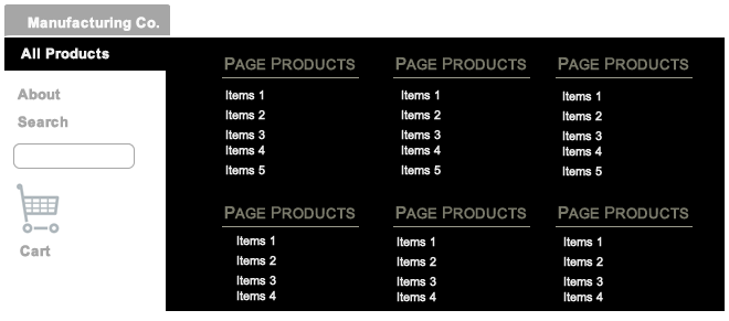
Fig. 3 Most Mega Menus are hover-based and include many categories, especially when a company manufactures many products for different industries. However, they can become cumbersome and difficult to read.
4. Write your menus
Start with the basics like Home, About US, Contact Information and Products. Group by category or industry. Again, think like your customer and keep the user experience and usability at the forefront. Keep in mind the purpose of your site and be simple. The main navigation menu will lead to all the inner webpages progressively, showing other menus appropriately. For example, if you manufacture different kind of sensors, you might want to have a label called Products on the main navigation, and a label called Sensors at the page-level menu in which you list the all the types of sensors you manufacture. These can later be divided further, like by industry or usage. Also, if you have a lot of orders through your website, adding Place an Order as a part of the main navigation or page-level would be really useful. Remember the purpose of your website at all times and the importance of the items on the navigation hierarchy.
5. Review and Optimize
At one point you will need to go back and learn from your users. Turn at your web analytics tools. Google Analytics gives you great traffic insights and it’s free. CrazyEgg also helps you to see what the hot spots are which menu items users are clicking on. If you don’t have any tools implemented, you must. Visit G2 Crowd Grid to learn more about different products.
Learn how your website visitors navigate your site. Look for clues and user behavior. Are they finding what they are looking for? Are they going where you want them to go? Is your website working the way you want it to work?
Pay attention to the users’ flow and use the insights to optimize your menus. You might be adding or deleting items on the menus. You need to be careful though. Think twice before making a change or adding new items to the main menu or making any drastic navigation changes.
Listen to your web users. Do polls using free online survey tools like SurveyMonkey or SurveyGizmo. A simple question like “Did you find what you were looking for?” could help you to “bubble-up” items or pages that are in hot demand.
Look into the internal search option of your website. That is also a good way to find what items are popular or what items are hard to find. You can prioritize these items and make an assessment if they should be part of the navigation.
Next Steps
Once you have decided what goes where, it is time to move to the usability part or UX of your website menus: the navigation styles. The navigation styles are how your navigation will be displayed: navigation bar, dropdown, fly-outs, breadcrumbs, text links, etc. Navigation style is a continuation to the question of what needs to be to be put out there? The next question to follow is, how do we show it? This seems to be a lot work, and it is. However, when your website is missing the core goal from its inception, and your users lack direction to the products or information they need, everything else from a design standpoint (color palette, logo design, etc.) becomes irrelevant. Navigation is the bridge between the information architecture and the essence of web design.


